
Brand Identity & Brand Style Guide Design
BeatsFestCourse Assignment for SNHU Class GRA 360




PURPOSE
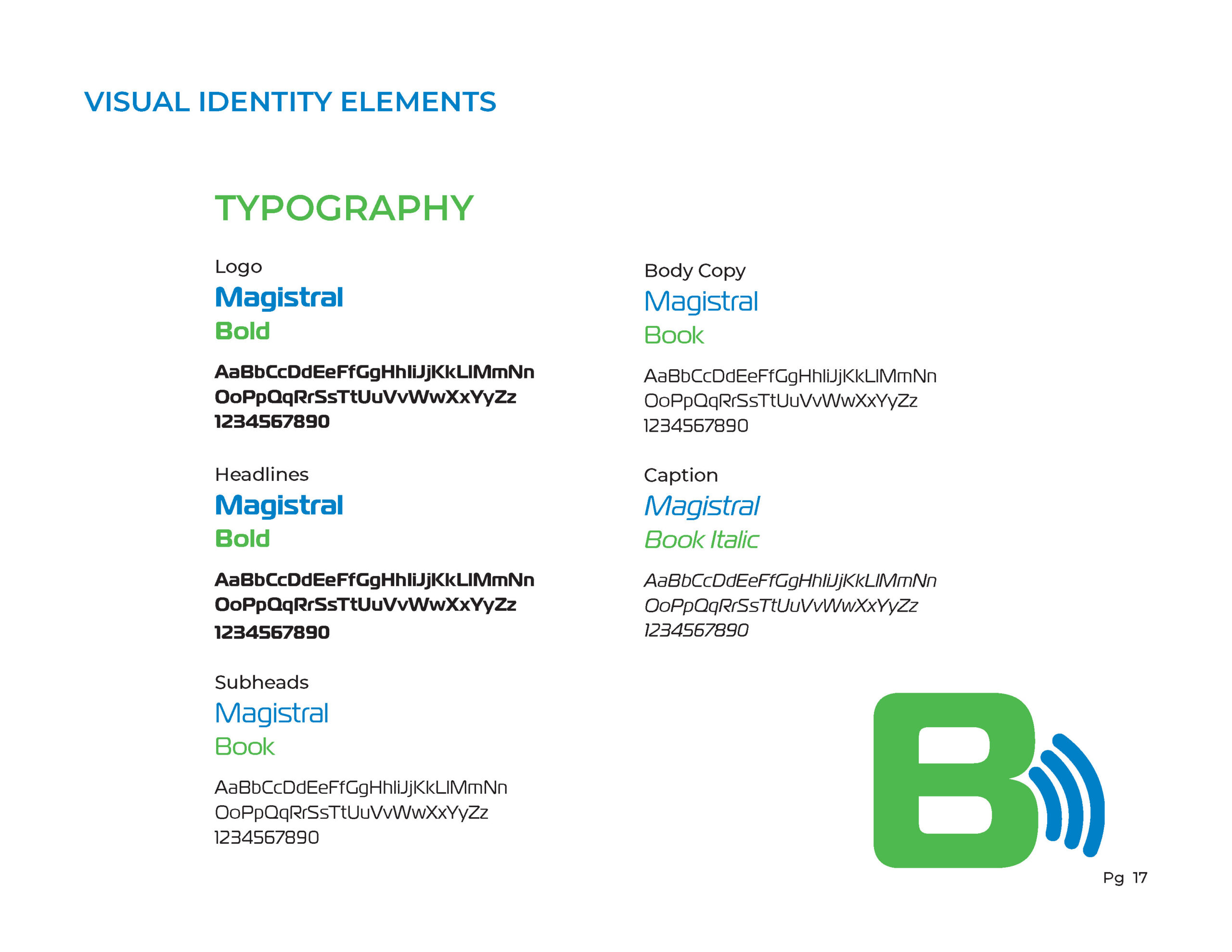
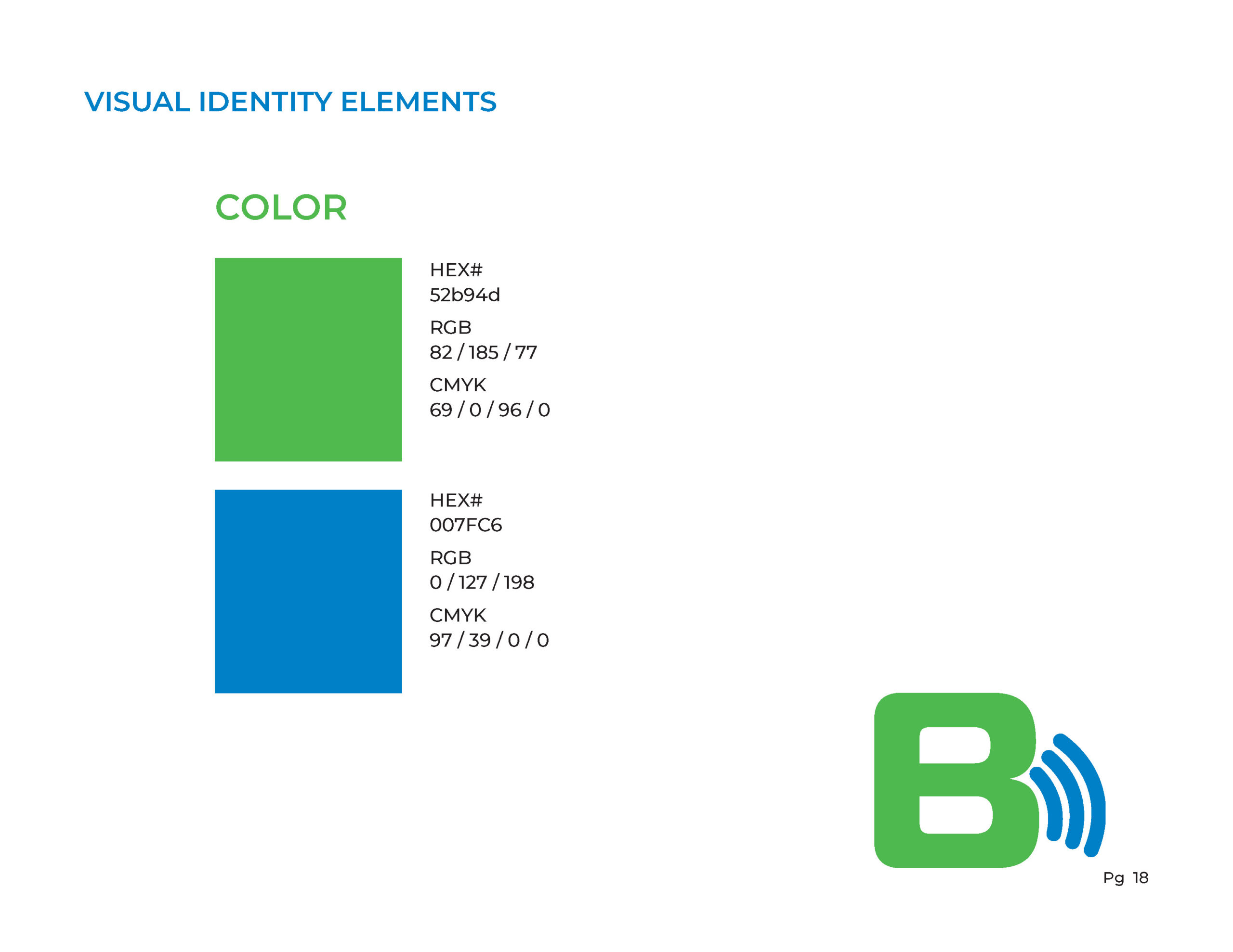
This design artifact includes both brand identity development and a brand style guide for BeatsFest (as part of a college course assignment for GRA 360). This brand style guide is intended to communicate the brand identity and rules for brand use. The audience for this style guide would primarily be business professionals that are working in connection with the brand and need to maintain consistency in other communications, such as a marketing agency or distribution affiliate. To be effective, the brand guide needs to be usable as a tool to communicate details about the brand such as their mission and vision. It also needs to clearly communicate rules for brand use, such as logo appearance, typefaces, color codes, and image styles. The information needs to be easy to find and understand, and usable as a reference and resource.
DESIGN RATIONALE
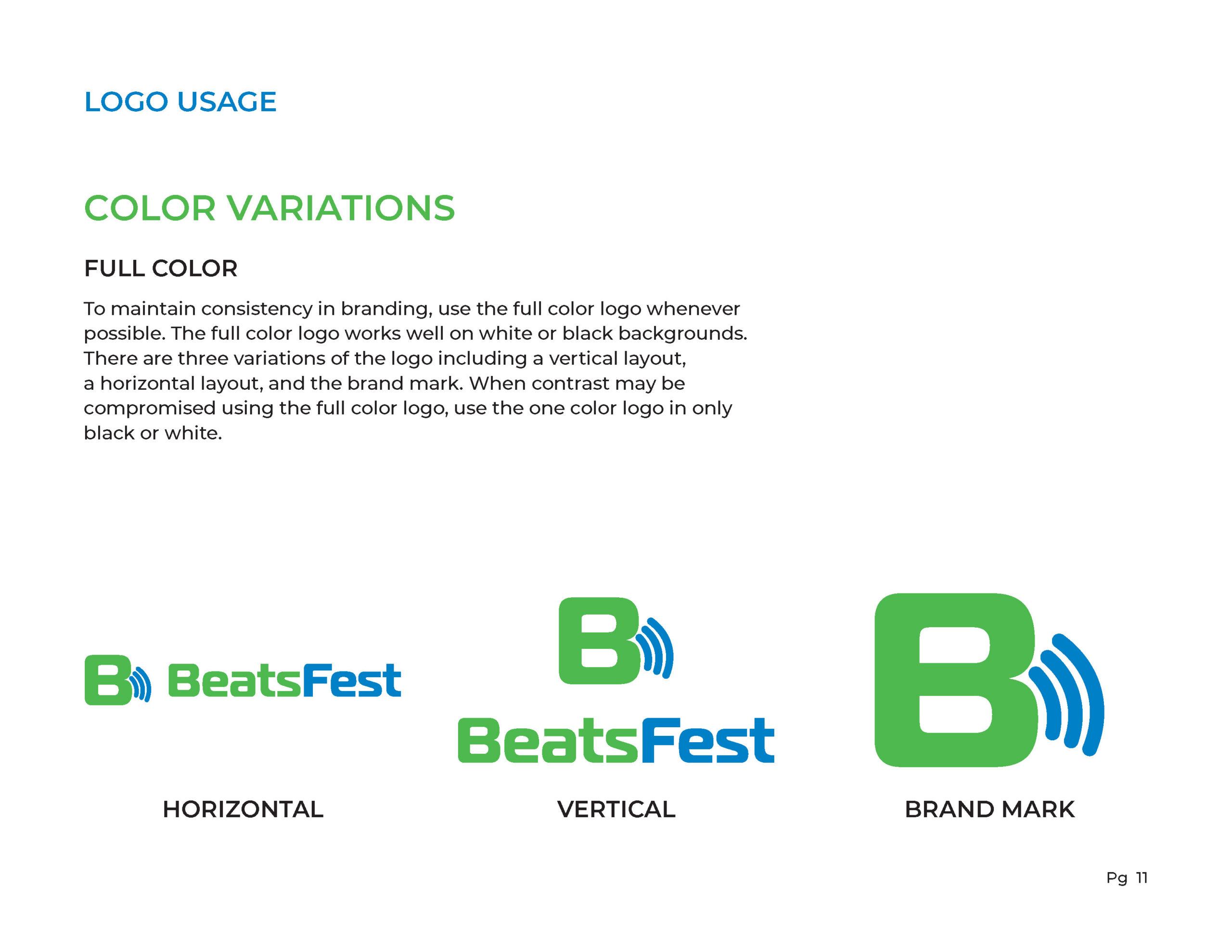
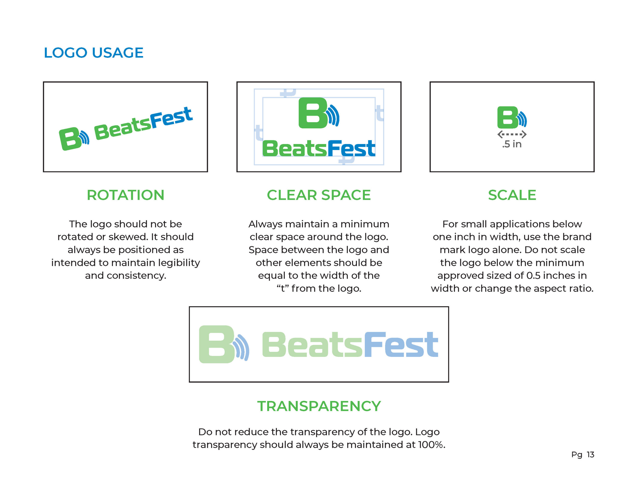
The overall concept of this brand style guide is to communicate how to properly present the BeatsFest brand in external brand communications through colors, typefaces, and logo usage. The style of the design is modern and simplistic, designed in the brands image with a bold and technical style. The brand style guide is more professionally structured than graphic heavy to serve as an informational tool that is usable and functional. It meets the audience requirements by being easy to navigate between sections and provides relevant information in a way that is easy to read and understand, with visual examples to support information when necessary. It doesn’t include any unnecessary design elements that distract from its intended purpose. Negative space is used throughout to keep information concise and easy to find and scan through. Alignment is used to create balance and structure throughout the layout. Repetition is also used to make the information easy to navigate through without getting overwhelmed. Repetition is also used with the logo and brand colors to create consistency and reinforce the brand itself. Color and contrast are used to highlight key elements, and size is used to create emphasis on headers and key points. This brand style guide clearly communicates the essential details of the brand in a concise and professional way.