Print Advertisement Design
Fresh Fare FarmsCourse Assignment for SNHU Class 415
PURPOSE
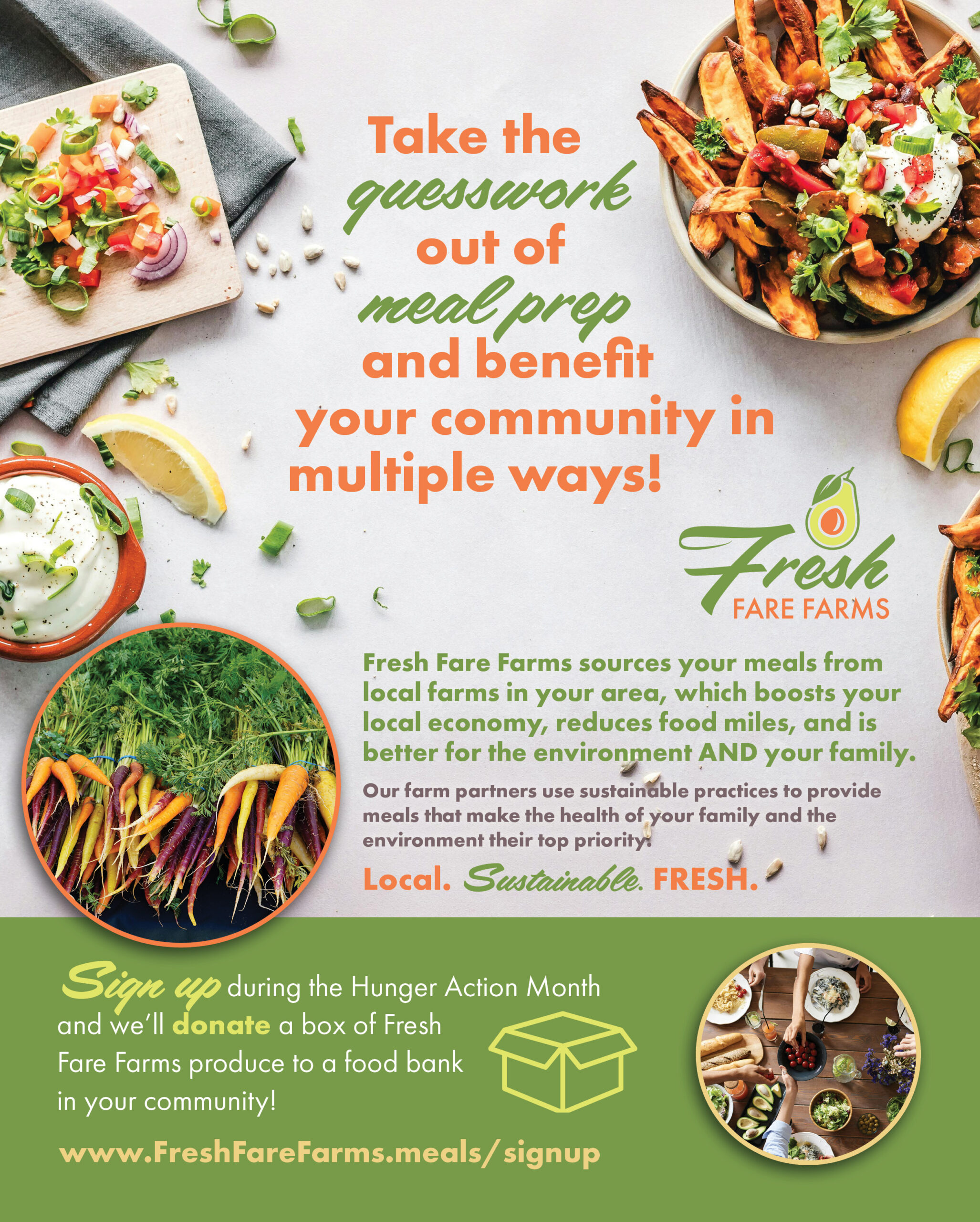
This design artifact is a print advertisement for Fresh Fare Farms as part of a multi-channel advertising campaign for Hunger Action Month (as part of a college course assignment for GRA 415). The design is intended to increase the company’s customer base by educating potential customers about Fresh Fare Farm’s meal kit delivery service, and to raise awareness about food insecurity within the community. The target audience for the meal service kits includes a diverse mix of men and women ages 21-35 that are busy professionals, families, singles, and college students. To be effective, the design needs to grab attention and be easy to read and understand. It also needs to convey information about the meal delivery service while highlighting their use of local and sustainable products. It also needs to feature a call-to-action that promotes signing up through their website.
DESIGN RATIONALE
The concept of this advertisement is to showcase simple ingredient meals that look delicious and full of fresh produce yet also look easy to prepare. The advertisement meets the needs of the audience by using bright colors, imagery and bold text to grab attention. Imagery of meals and meal ingredients, as well as fresh produce from the farm, are offset to each edge with negative white space between to create deep contrast for the messaging between that connects the concepts of simple ingredients and a completed meal. It also communicates information about the company’s values on sustainability and locally sourced produce, as well as features a call-to-action with a bold link that stands out for readers to easily take action. Color and different typefaces are used on the text to create a hierarchy and highlight key words to gain interest in a quick visual scan. Alignment and shape are also used to create balance and structure, making the ad easy to navigate and read. Shape is also used to create a simple visual icon to represent the call-to-action information so readers can quickly make the connection that the “sign up” relates to delivery.